Alexandra WestcottUX/UI & Branding
Alexandra is a designer who listens closely so she can ask the right questions. She creates digital experiences that build from conversation, inform deeper understanding, and lead to positive interaction. Alexandra is enthusiastic at the piano, loves to rockclimb, and always labels her layers—always.
Dean’s List
x3
Mitacs Business Strategy Internship 2020
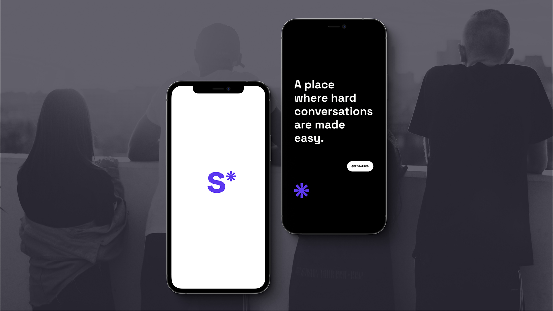 UX/UI for So, a comprehensive sex education mobile app for iOS.
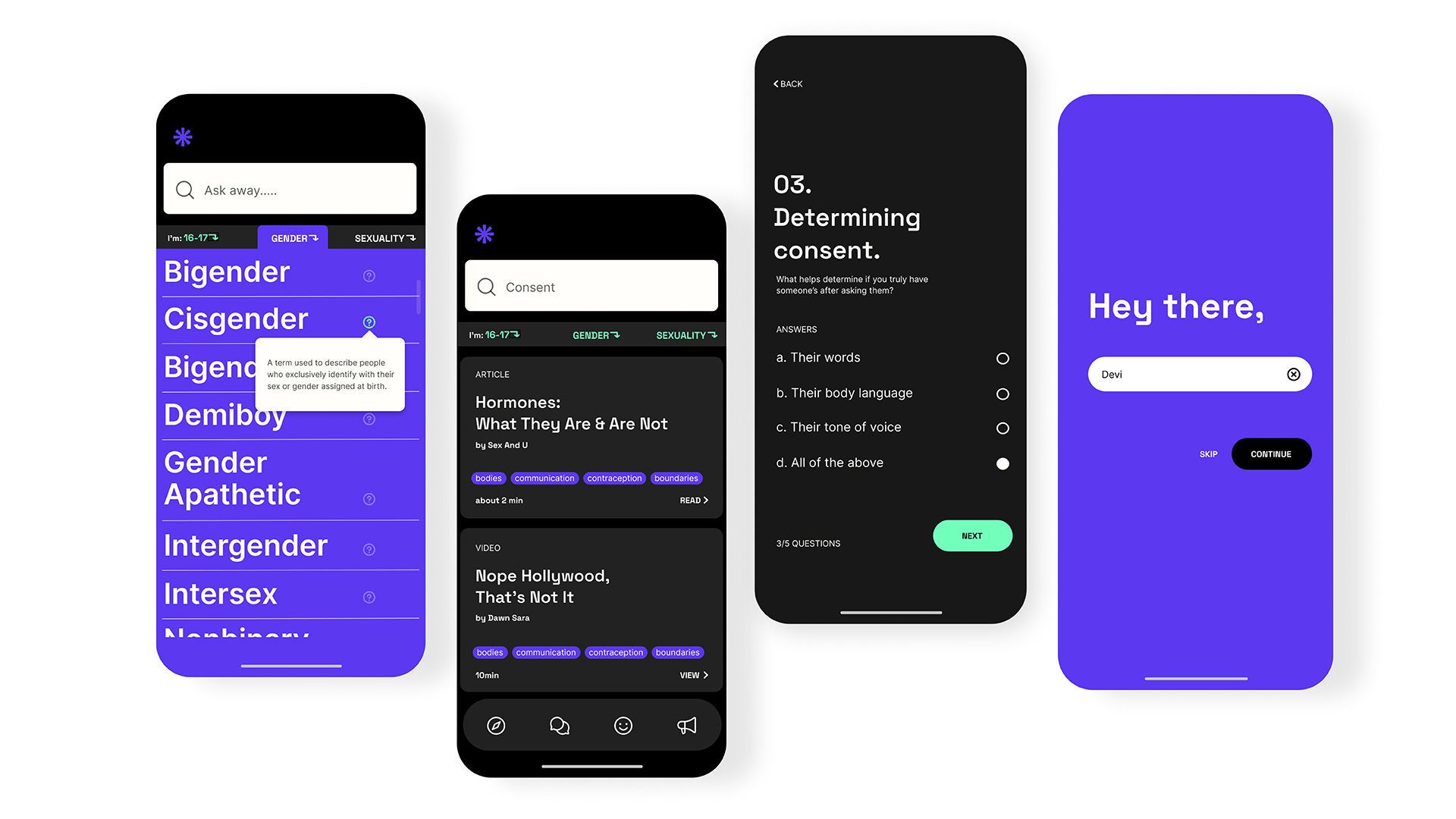 So was created to improve and diversify how Canadian youth learn about sexual health.
 Typeface design inspired by the chaos and creativity of the early 20th century. Guerlain, a favorite fragrance of Marlene Dietrich, is not unlike her: sharp, polite, humanist, charming and provocative. If the typeface could, it would drink Old Fashioneds and smoke Gitanes.
Design and kinetic-type animation for Let’s Talk Feelings, a digital awareness campaign for young adults. It connects those experiencing pandemic induced isolation, anxiety and burnout for the first time with online resources that can bring relief.
 UX/UI for Chainmail, a digital mobile wallet using blockchain technology to offer secure international, low cost, peer-to-peer transactions.
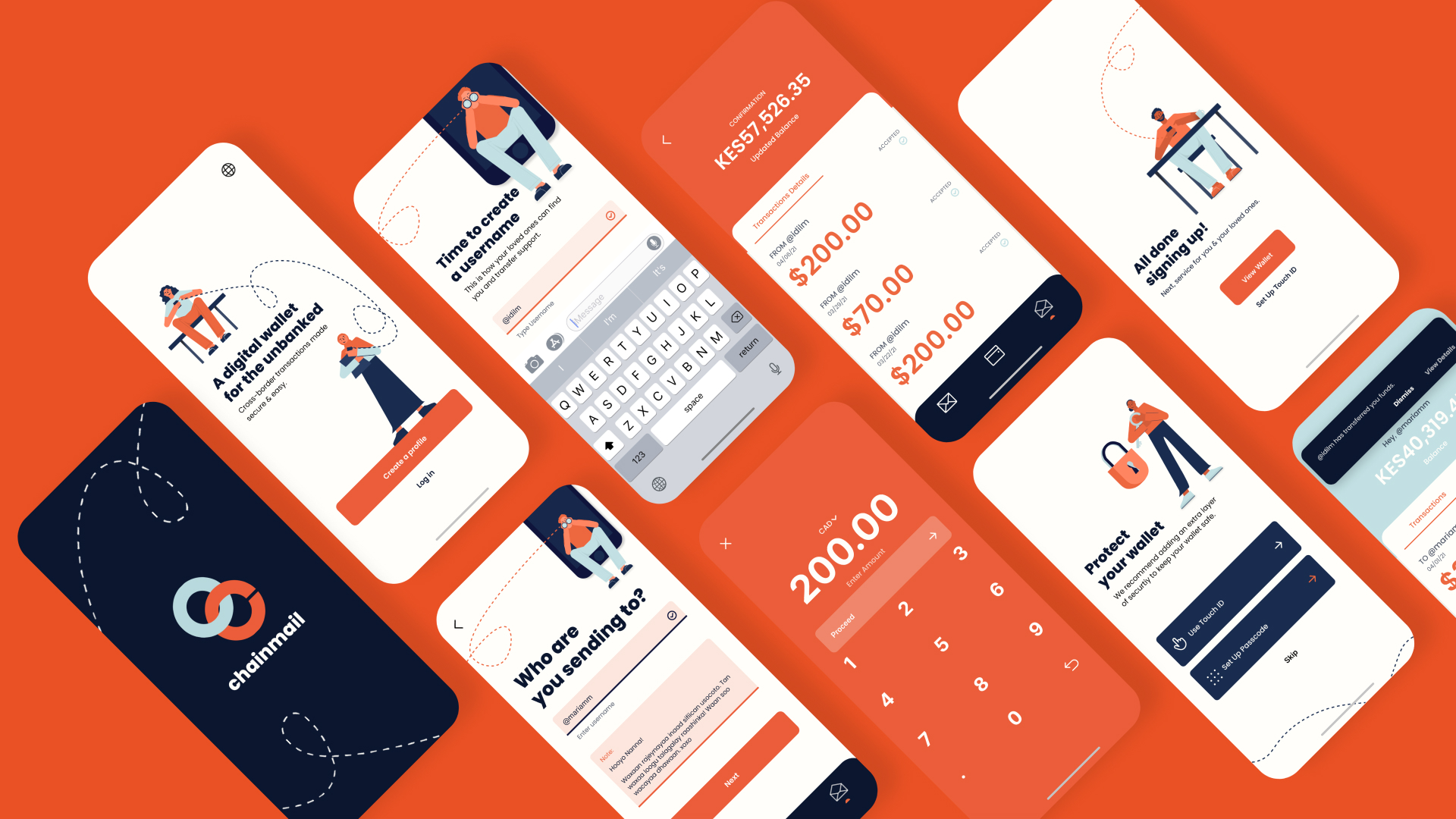 Chainmail works from anywhere, for anyone, even when they have different service providers or different software.
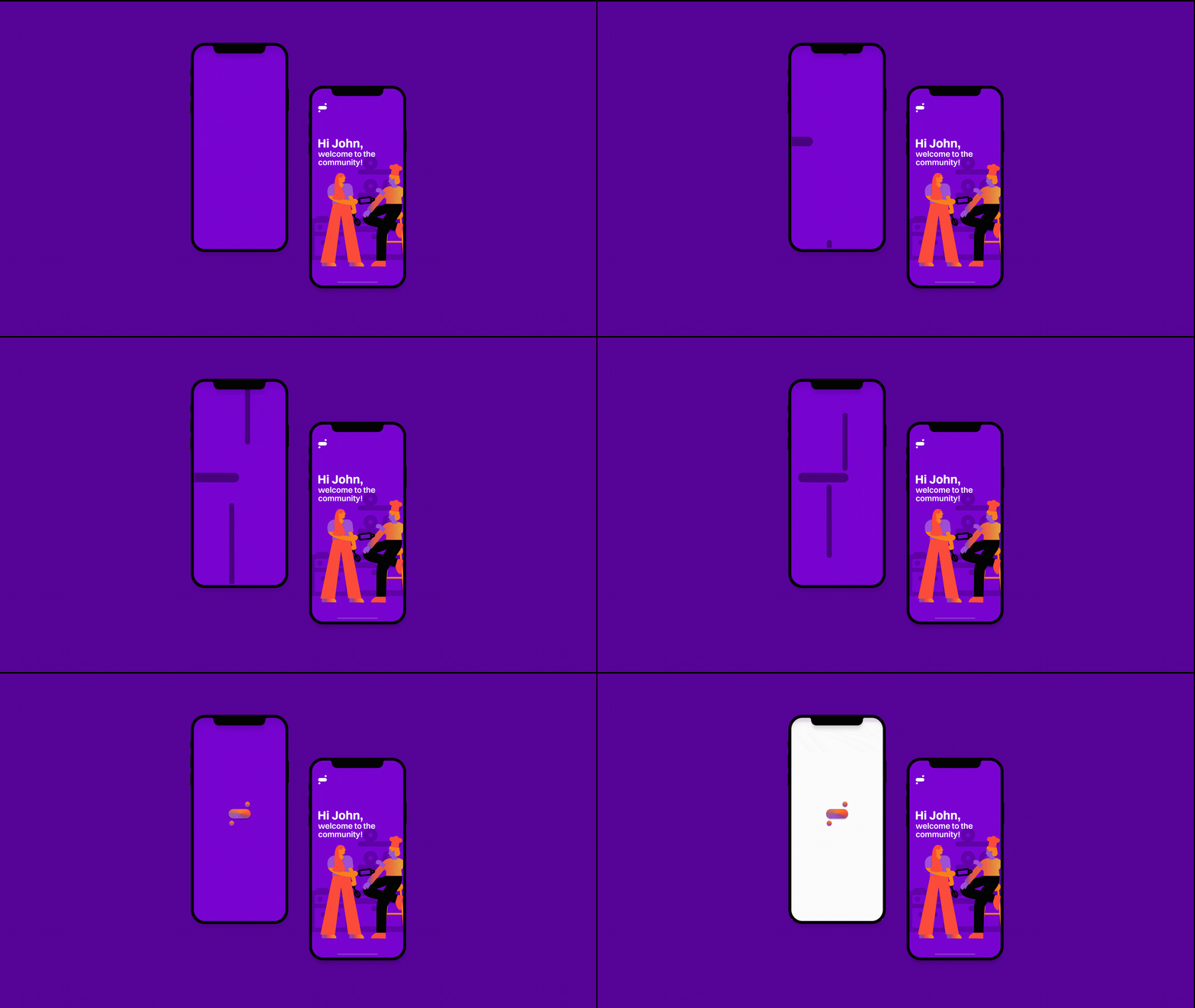 UX/UI for Counterparts, an app for iOS that enables food start-ups to find more affordable and accessible commercial kitchen space to rent.
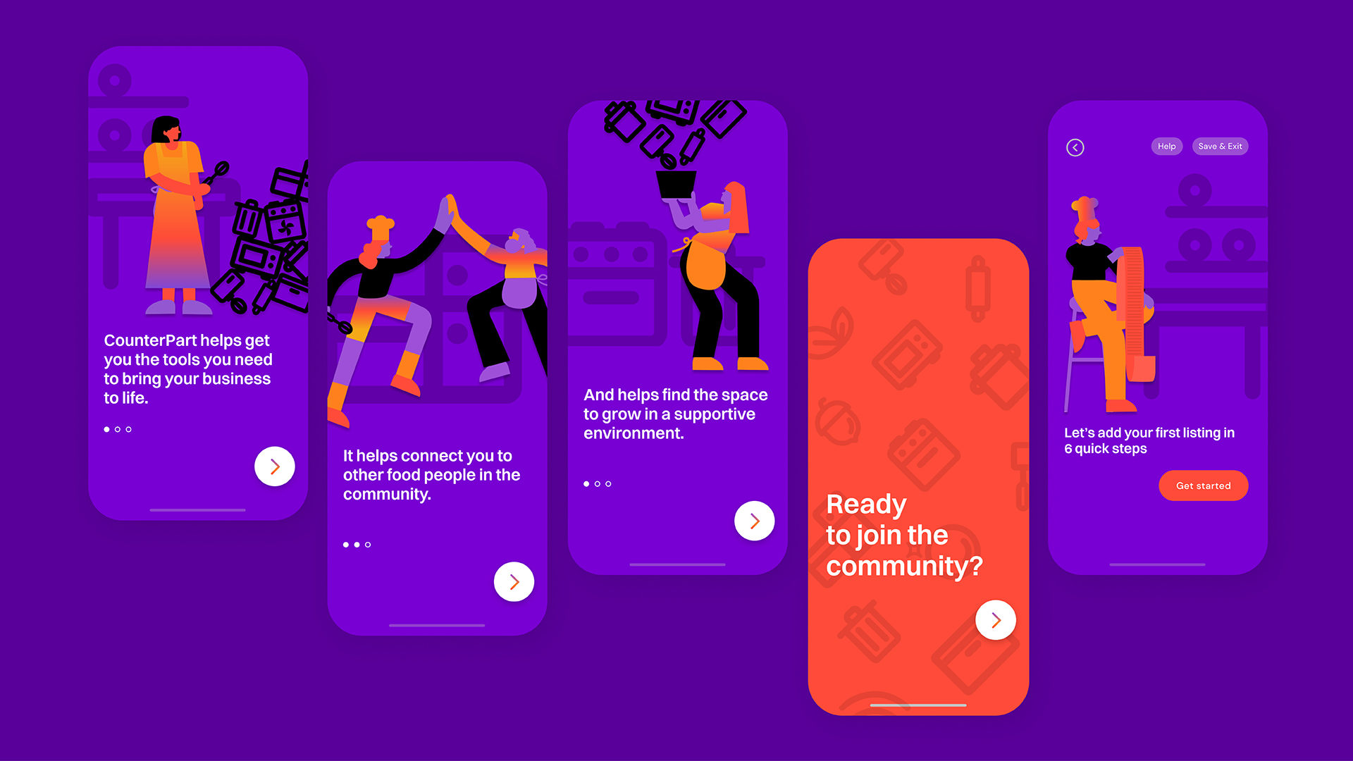 This self-serve tool also lets owners of food service establishments capitalize on underused space while their businesses are closed.