Talia RouckBranding & Illustration
Talia Rouck is a graphic designer, illustrator, & self-confessed niche-hopper. Although the credits on her coming-of-age story are still in process (with talk of a sequel), she’s thrilled to continue defining herself and her work through human-centered design. Tal’s passion for accessibility, approachability, and a fondness for technicolor all feature in her body of work.
Adobe Student Awards
2019 Winner
Applied Arts Awards
2020
Dean’s List
x 8
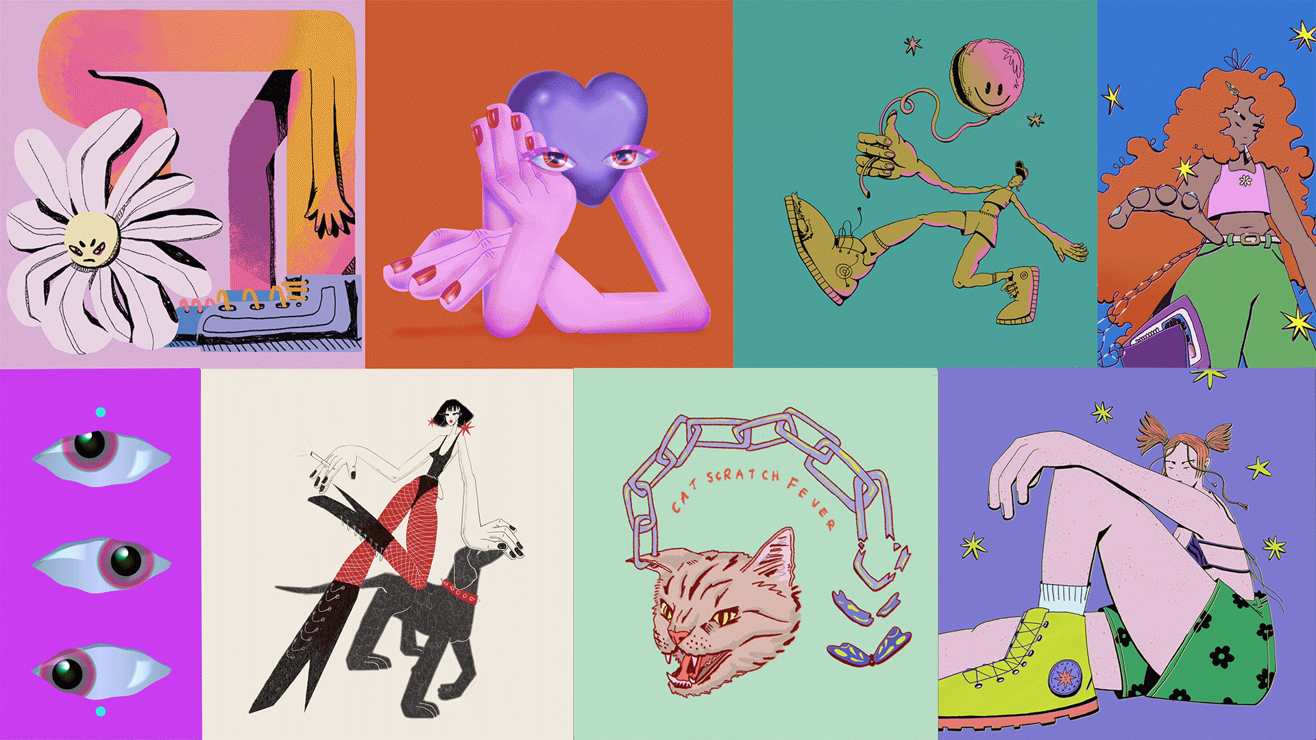 A showcase of Talia’s process work and final character illustrations.
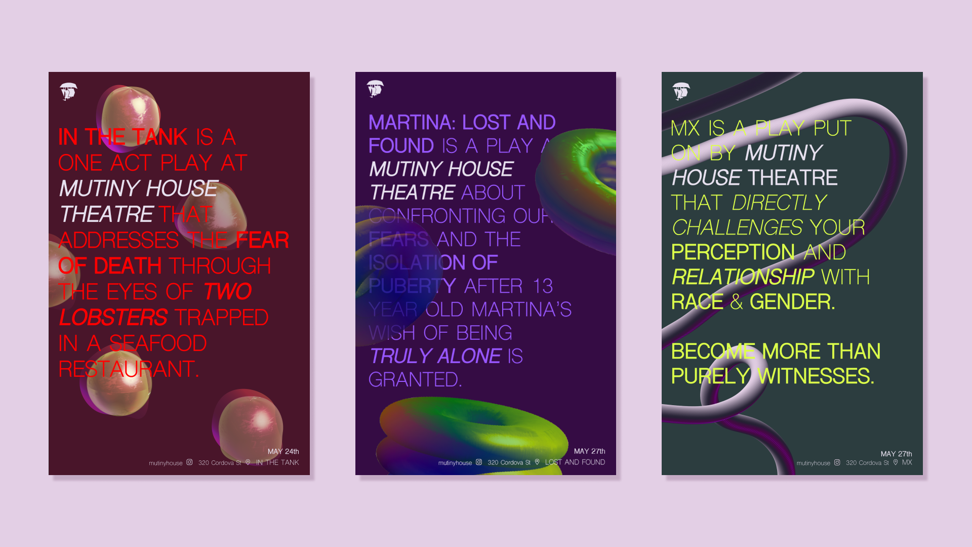 Branding and poster series for a Vancouver-based theatre that aims to make alternative theatre more appealing to the public by taking them on a journey of self-discovery.
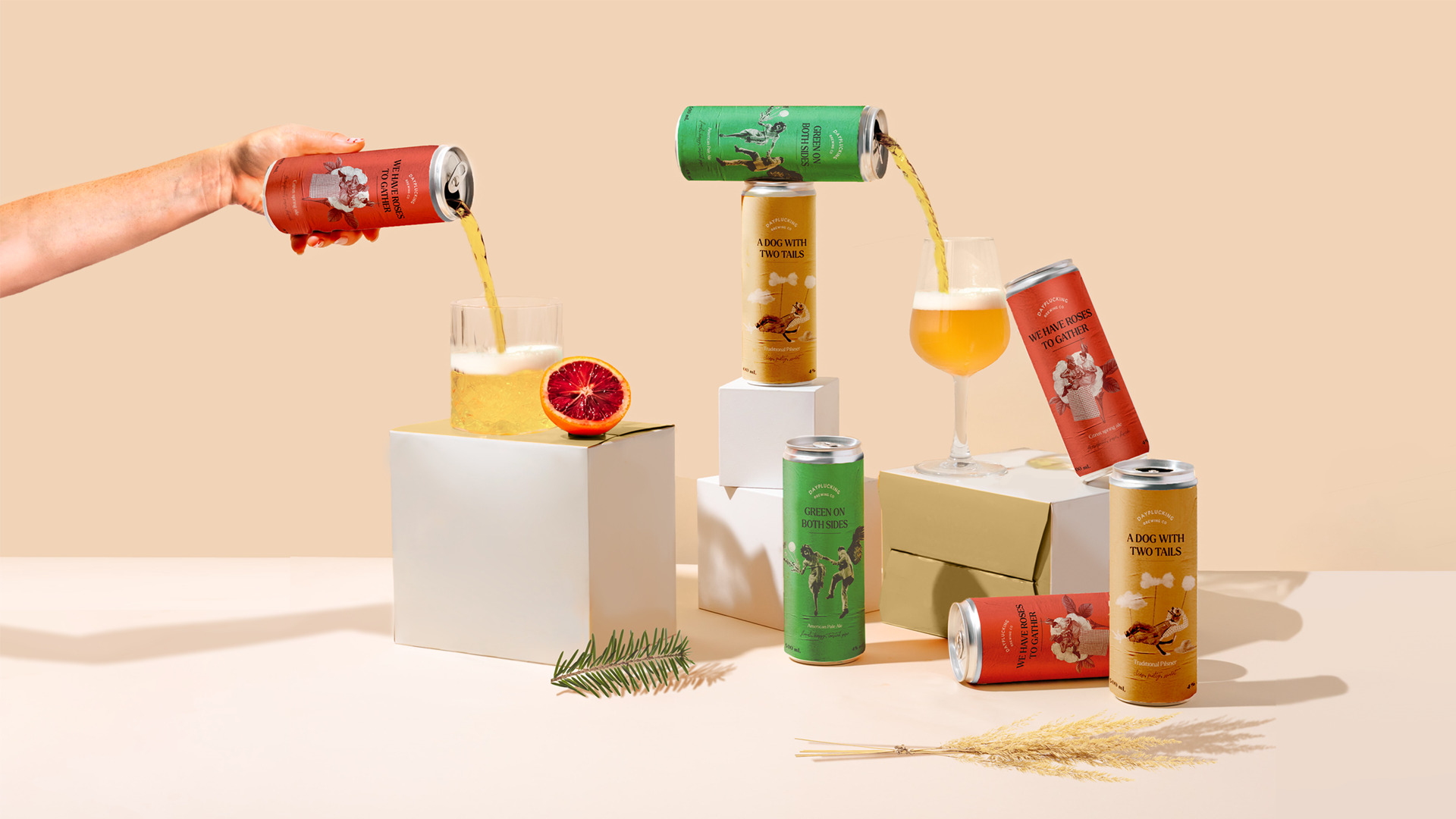 Branding and packaging design for a fictional brewing company that inspires beer lovers to appreciate little moments while easing back into social activities post-pandemic.
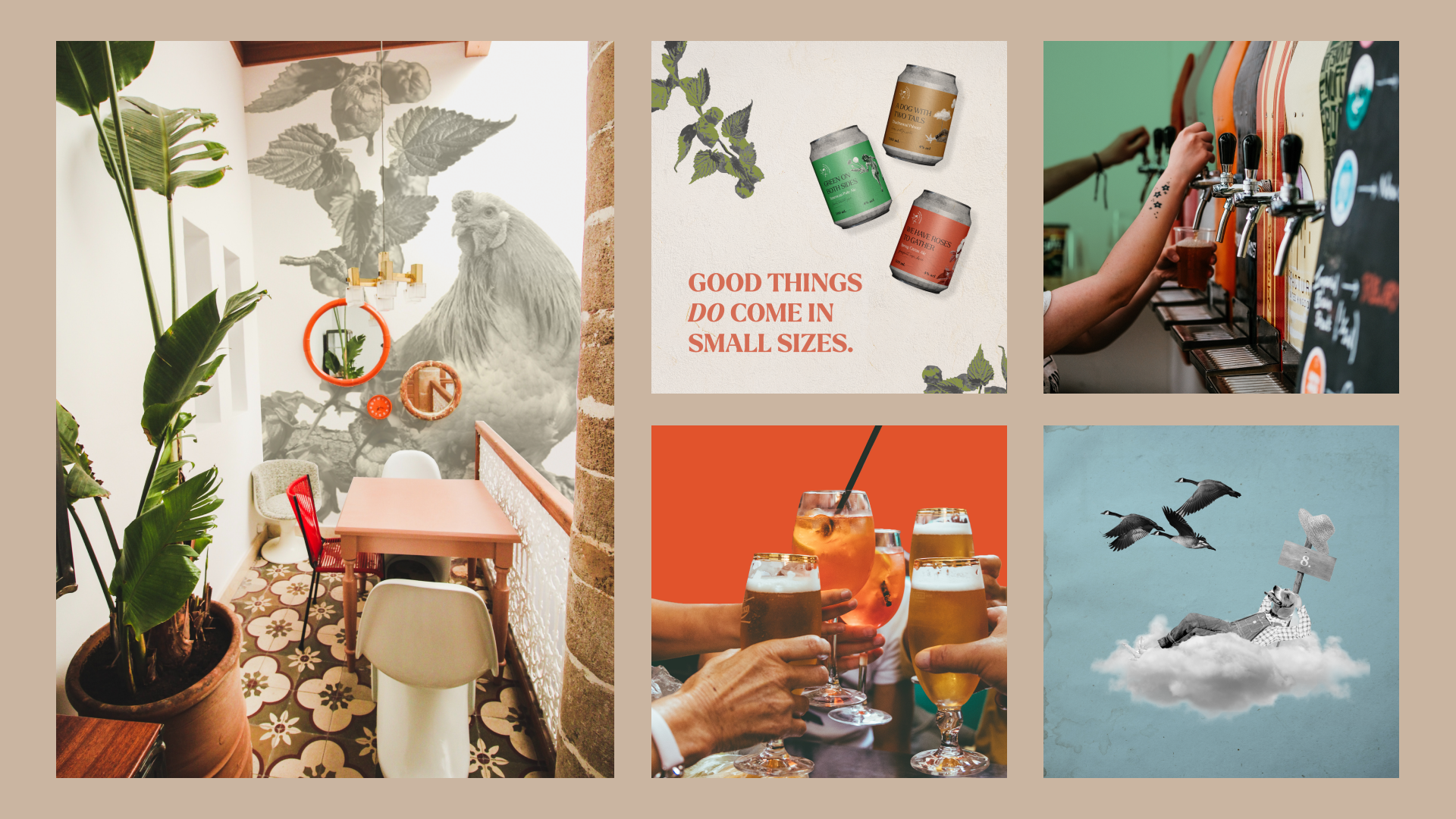 Mural, interior, and social media design for Dayplucking Brewing Co.
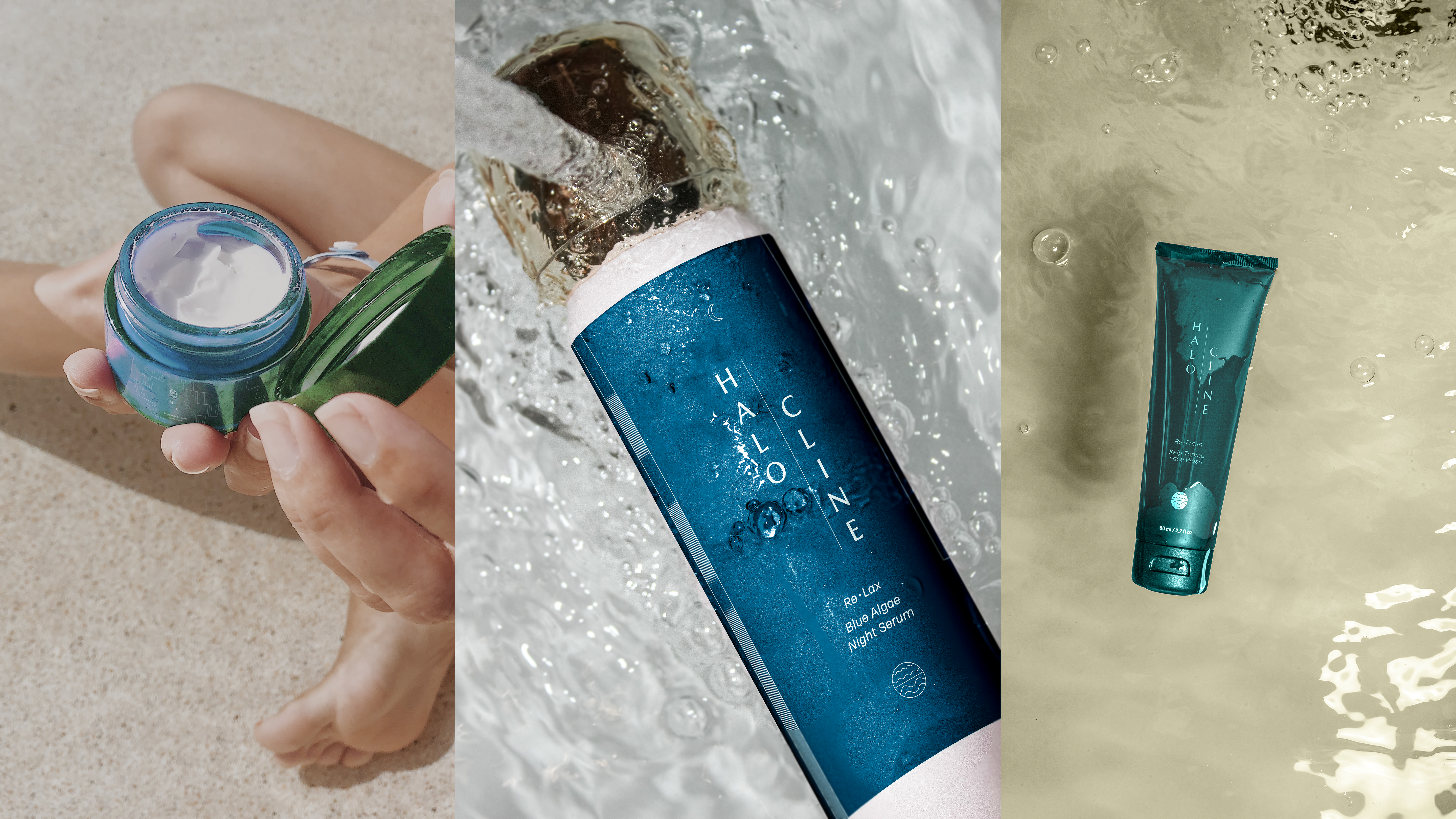 Branding and packaging design for a saltwater-based skincare line for mature buyers, inspired by the beauty and simplicity of mineral crystal formation.
Branding, web, and social media design for a medical resource that connects rural queer patients and specialized primary caregivers through telemedicine.
Instagram campaign targeting rural communities that informs and humanizes how patients living in isolated areas can access queer-friendly medicine.
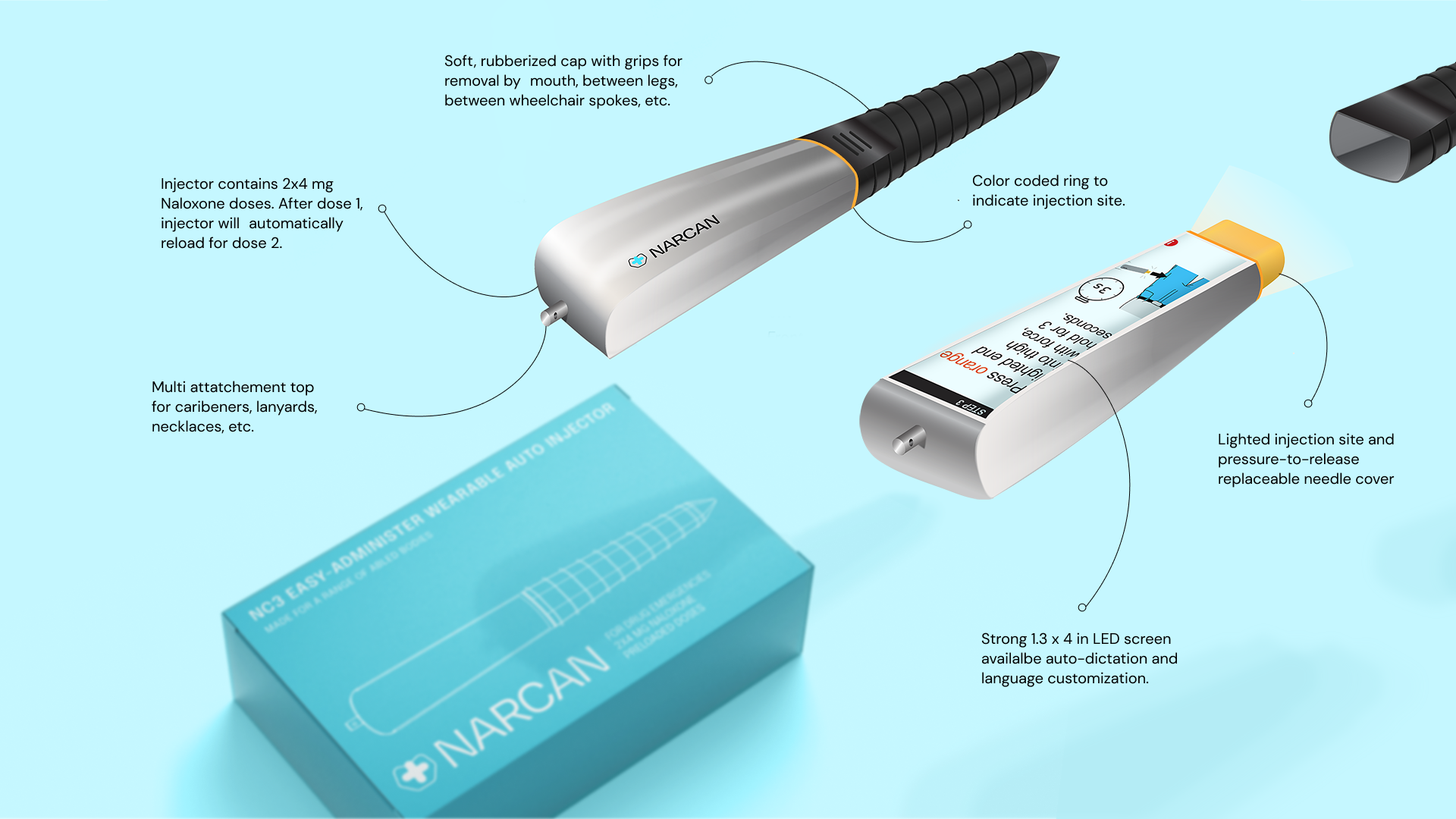 Branding, packaging, and product redesign for an accessible, wearable naloxone-autoinjector developed specifically for a range of able and disabled bodies.