Katarina
Yaremkewich

Branding she, her

Katarina brings a people-focused approach to branding and design. Rooted in a deep appreciation for nature and guided by empathy, her work creates experiences that amplify the voices of those who often go unheard. With each project, she tells authentic, purpose-driven stories that resonate with her client base.

Profile photo of Katrina Yaremkewich and one work thumbnail.
An open magazine spread featuring an advertisement for Nalu Swimwear. The backdrop is an image that covers the spread with an aerial view of a surfer in a bright purple swimsuit riding a yellow longboard on a dynamic wave. The left page showcases the tagline 'Hold it together' in pink, followed by the Nalu logo, with the subtext 'No-Budge Swimwear.' The bottom of the page includes the text 'Experience the perfect balance of support and freedom with Nalu Swimwear.’

This bold, energetic brand identity and campaign for Nalu Swimwear highlights performance-driven swimwear for active individuals through dynamic imagery and empowering messaging.

CREDITS: MOCK-UP FROM PIXELBUDDHA. IMAGE FROM PEXELS. MENTORSHIP BY SYD BEY AT ORIGIN.
A visual showcasing Nalu Swimwear’s branding. The large "N" in pink stands against a black-and-white image of two surfers on the beach. Below, three posters display Nalu's campaign with vibrant colours and dynamic photography. The final image features the Nalu logo in a clean, bold typeface on a dark background. The visuals balance sophistication and an active, ocean-inspired lifestyle.

Brand identity for Nalu Swimwear, an athletic swimwear brand.

CREDITS: MOCK-UP FROM MOCKUPS-DESIGN. IMAGES FROM PEXELS. MENTORSHIP BY SYD BEY AT ORIGIN.
A trio of bold posters promoting women's health awareness with playful yet empowering messaging. The left poster features a silhouette of a person wearing underwear in green and purple tones, with the text 'Every bottom gets a taste of the orchard' and the brand name 'Georgia' in a rectangular box. The center poster displays a peach in green and yellow hues on a teal background, with the text 'Love your pulp' and the 'Georgia' branding in orange. The poster on the right shows a close-up of a person’s hip and lower back in orange and purple tones, with the text 'Take charge of your discharge' and the 'Georgia' branding above.

Georgia is a bold, inclusive underwear brand that uses sustainable material made from peach pulp. Designed for vaginal discharge, their vibrant identity and cheeky messaging celebrates individuality, comfort, and stigmas.

CREDITS: MOCK-UP FROM MOCKUPS-DESIGN IMAGES FROM PEXELS. TEAM PROJECT WITH KAREN UNNSTEINSDÓTTIR AND TIN RAGANIT.
Outdoor banner raising awareness about endometriosis, divided into three panels. The left panel features bold green text on a dark background that reads: 'Infertility is a struggle, endometriosis makes it a fight,' accompanied by an image of a person holding their stomach. Smaller text explains how endometriosis affects fertility, increases miscarriage risks, and mentions advocacy with a website link. The center panel, in bold lavender and green text on a blue background, states: 'Your pain has a name: Endometriosis.' The right panel features green text reading: 'Push for the care you need, not just the care they offer,' paired with an image of an abdomen. Smaller text below emphasizes the importance of advocating for proper healthcare, alongside the same website link for further information.

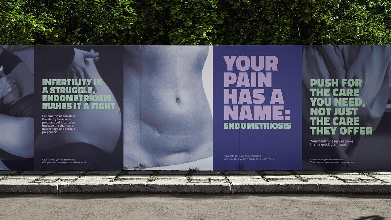
This campaign raises awareness about endometriosis, empowering individuals to recognize symptoms and challenge dismissive narratives while advocating for earlier diagnosis through impactful print and social media initiatives.

CREDITS: MOCK-UP FROM MOCKUPS-DESIGN. IMAGES FROM PEXELS.
Billboard highlighting endometriosis awareness. The left side lists symptoms in bold text: fatigue, heavy bleeding, pain with intercourse, bloating, migraines, back pain, infertility, depression, and brain fog on a lavender background. The right side features a black-and-white image of a curled-up person, evoking discomfort. Beside the image, the bold text reads 'Your pain has a name: Endometriosis' in lavender and green on a deep blue background. Below, the small text encourages advocacy and provides a website link: 'Advocate for your endometriosis. Visit youdeserveanswers.com to learn more.'

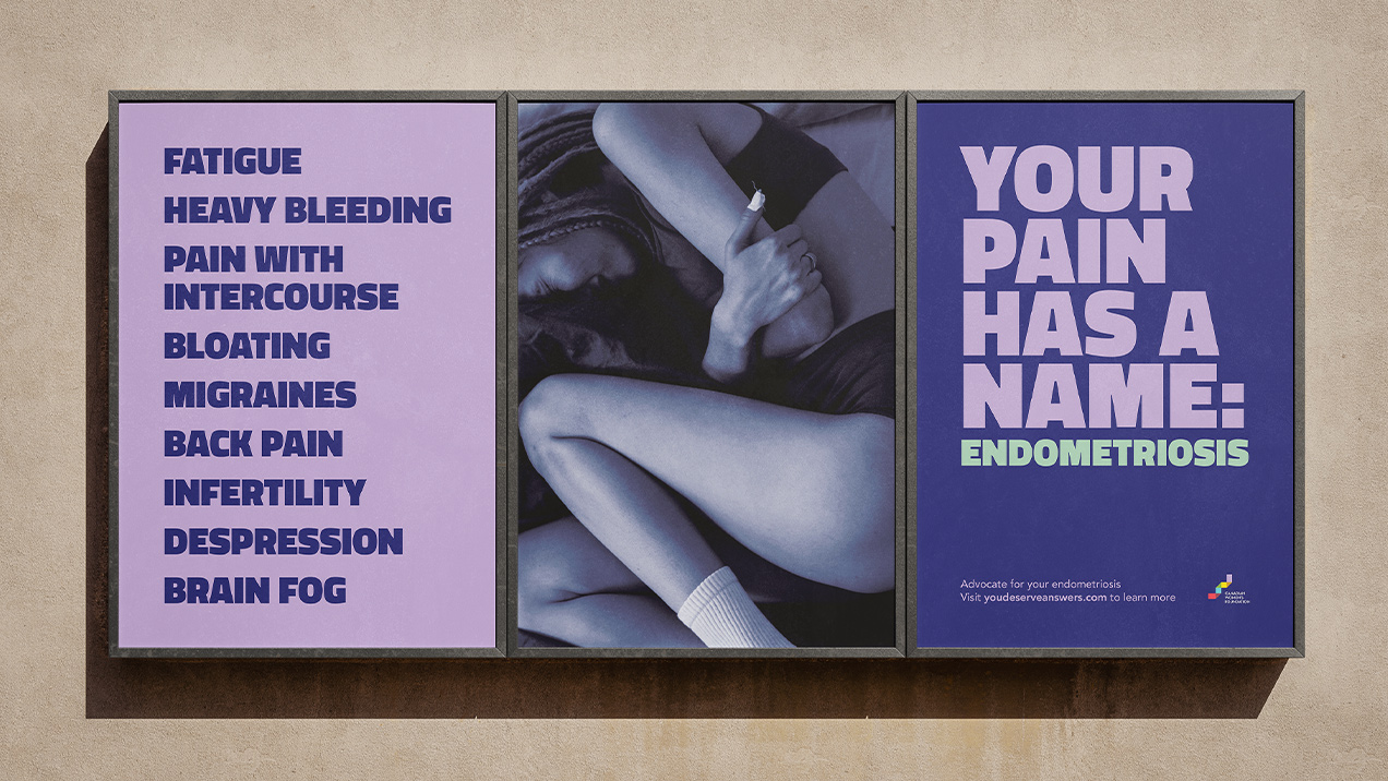
This campaign raises awareness about the often-dismissed symptoms of endometriosis that many experience without a diagnosis.

CREDITS: MOCK-UP FROM MOCKUPS-DESIGN. IMAGE FROM PEXELS.
Image showcasing promotional materials for a women's dirt biking club. On the left, a phone displays an Instagram post featuring a bold graphic of a dirt biker and the text 'We Don't Ride B*tch.' On the right, four square print designs include phrases like 'We Wear Mud More Than Pink,' 'We Aren’t Biker Chicks,' and 'We Don’t Ride B*tch,' emphasizing empowerment and breaking stereotypes in the sport

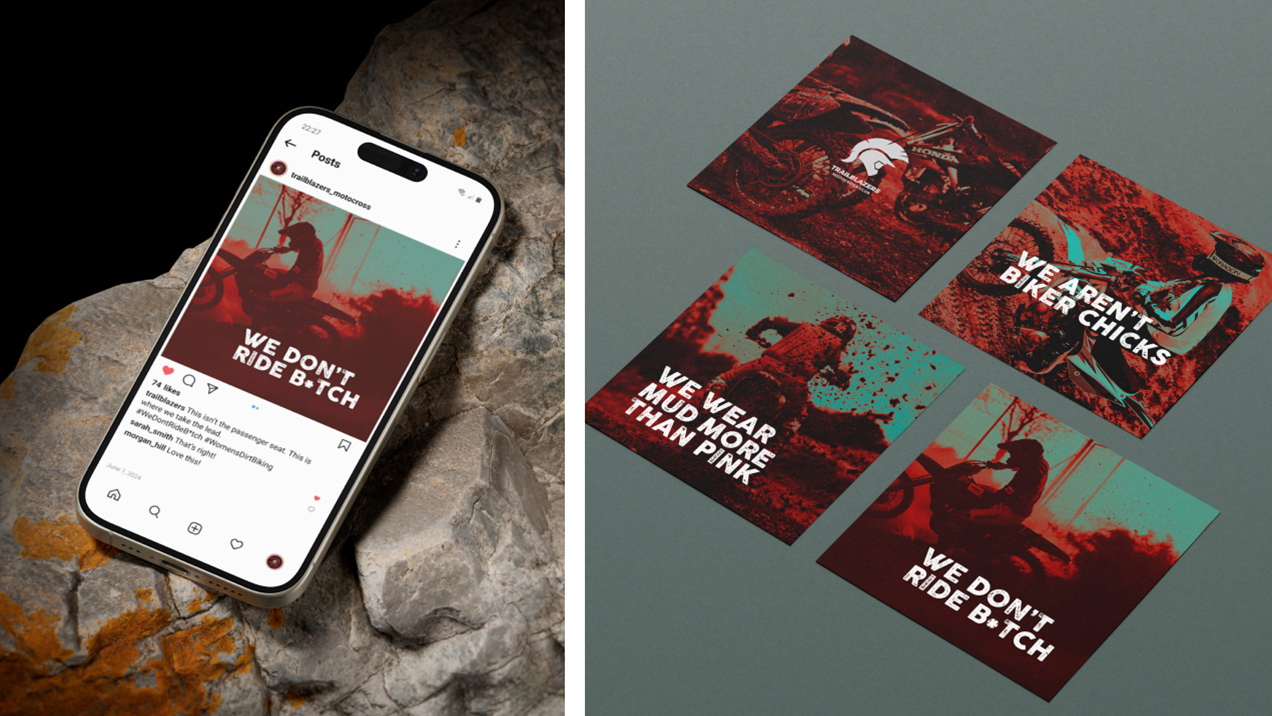
This branding project creates a bold identity for a fictional women’s dirt biking club, celebrating empowerment, adventure, and connection while inspiring pride, unity, and a shared passion for the ride.

CREDITS: MOCK-UPS FROM PIXELBUDDHA. IMAGES FROM PEXELS.