Bachelor of Design in Visual Communication

Interdisciplinary

Siobhán

Barry

She, Her

Siobhán is an interdisciplinary designer who thrives in the chaos of ideation, challenging defaults to craft concept-led work. Her sociology and cultural studies background provides a research-driven, human-centred perspective, guiding strategic and creative decisions. Known for diving deep into problems, Siobhán turns them inside out to reveal unexpected and compelling solutions.
Descan Salazar Student Awards, Branding, Honourable Mention, 2025
RGD Student Awards, Advertising Design, Winner, 2025
Capilano University, Dean’s List, 2022–2026
A mock-up of three different posters hanging on a cement wall.
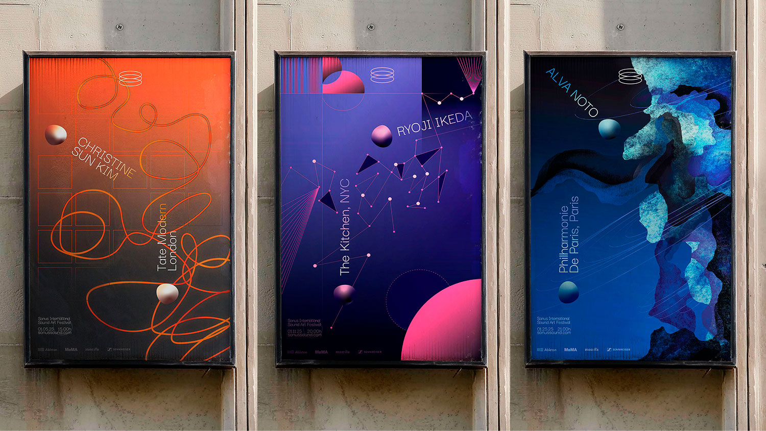
SONUS Sound Art Festival attracts art and music enthusiasts who are drawn to abstract work that makes them think and feel. How might a visual system evoke not just what sound is, but how it feels?

Credits: Poster mock-up by MockupProduction, sponsorship logos from Ableton, MoMA, Mozilla, and Sennheiser.

Rotating GIF of three images: the first shows a desktop home screen across two laptops resting side by side on a granite surface. The second image is split into four, displaying four laptop mock-ups from a side angle in white, blue, orange and purple. The third image features 3 desktop UI mock-ups, superimposed on a grainy background, set behind laptop screens.
I approached the branding as a means of facilitating curiosity, emotional depth, and critical reflection. Thus, the intangible qualities of sound are visualized through typographic and illustrative abstraction.

Credits: Laptop mock-ups from Kurt Winter Design, background image of web UI from Pexels.

Three vertical, brightly coloured poster designs on a black background promoting a financial education brand called Wellfare. The first poster has a turquoise background with purple text reading “Someone mentioned their RRSP, and you replied with ‘find out what it means to me’,” accompanied by a see-no-evil monkey emoji and the tagline “we get it, it’s a banger.” The second poster is blue with yellow text that reads “tfw u haven’t checked ur credit card statement in 6 months…” and a pair of eyes emoji, followed by the line “we’re not worried.” The third poster is red with a disco ball graphic and text explaining the cost of Beyoncé concert tickets and how saving in a high-interest savings account could help afford them, ending with “focus on your priorities, we will help fill in the blanks.” All posters include the Wellfare logo and the tagline “the best financial teacher you never had.”
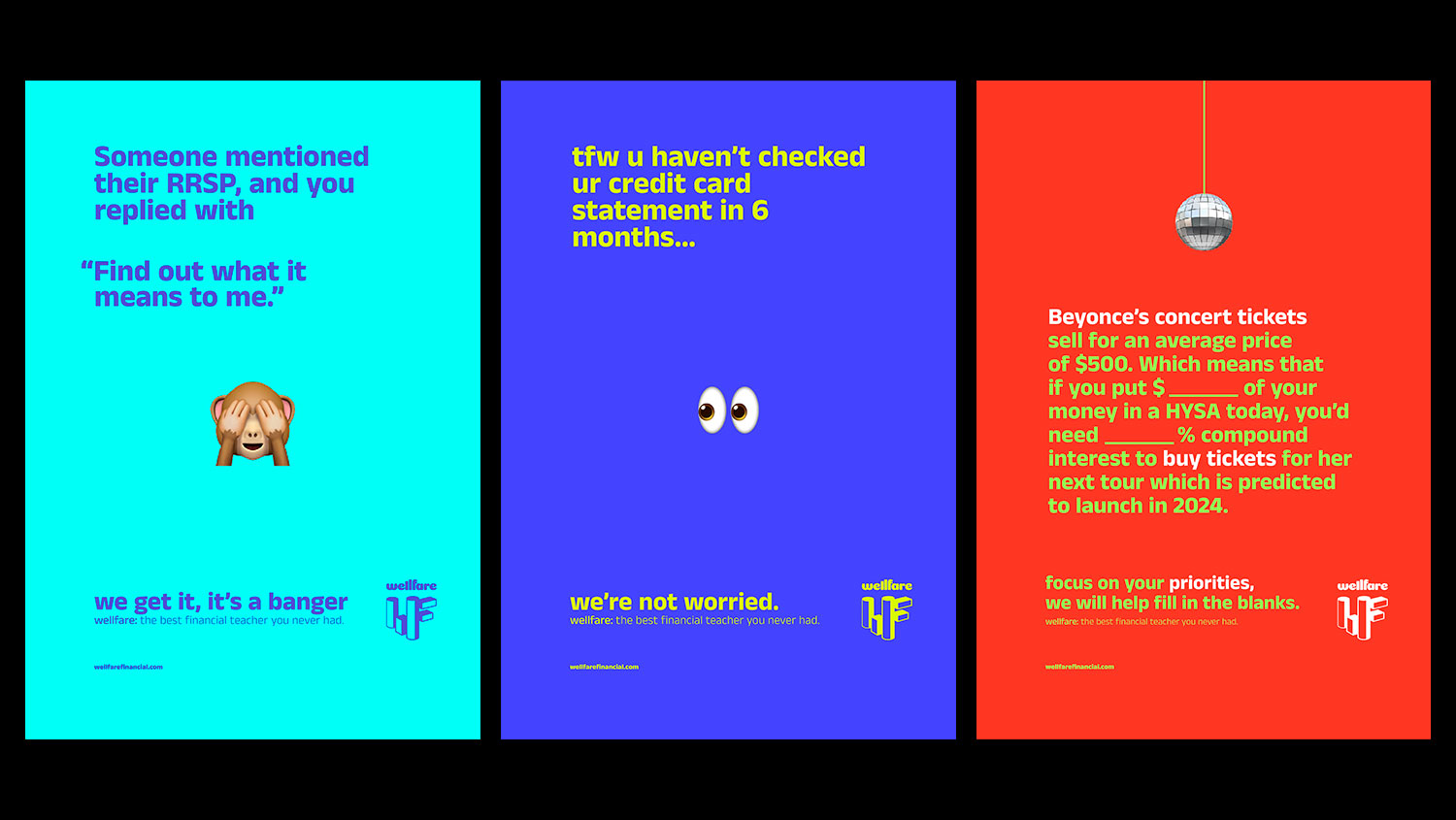
The world of financial education is bland. It is limited in its representation of unique and diverse life experiences and identities. Wellfare is a brand that is approachable and accessible to everyone.

Credits: Emojis from Apple.

Animated black background with bold white text reading “The best financial teacher,” followed by the phrase “you never had” highlighted in bright green. The Wellfare logo appears in white in the bottom right corner. Animated GIF moves through a range of brand elements, including a tote bag, iPhone mock-up screen, and bus advertisement.
Wellfare’s brand employs a sense of humour and honesty to connect with its target audience’s desires and language. No one ever said personal finance couldn’t be casual, relatable, or even fun.

Credits: Emojis from Apple, tote bag mock-up from BrandNewMockups, images from Unsplash, iPhone screen mock-up by Creatoom.

A GIF shows a Cold One beer sitting inside an ice cave, rotating to display the label design, with the label’s copywriting and the can logo displayed in static form on the other side of the image. The text reads: Meet Nelly, the local abominable snowperson here in Nelson. There’s nothing like some winter-time frost and sheets of thick, powdery snow to get this snow monster out of her cave. Nelly prefers to lie low through most of the year; there’s not a lot the summer or fall seasons have to offer this snow monster, aside from heavy sweating and dehydration. But come wintertime? Nothing gets Nelly out of her cave faster than a refreshing Nelson Brewing Company cold one.
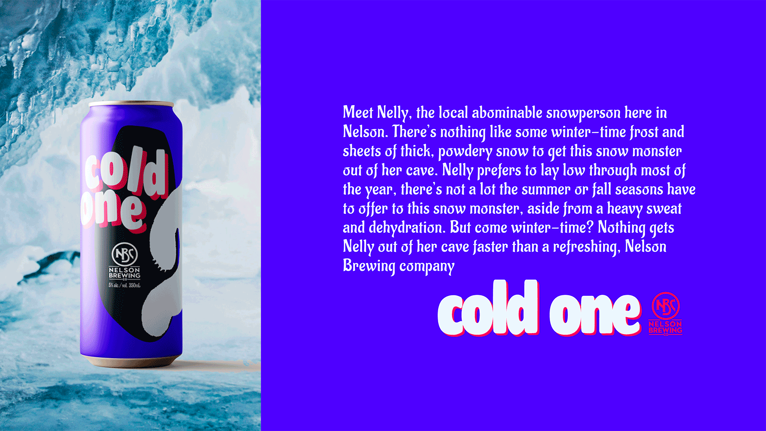
To stand out within a market saturated by geometric aesthetics and mountain town stereotypes, this brand refresh uniquely personified the novelty of a winter ale.

Credits: Beer can mock-up from MockupFree, background image from Pexels, Nelson Brewing logo from Nelson Brewing Company.

A GIF rotating through product packaging mock-ups for an Italian food brand called Per Tutti. This includes illustrated tomato sauce cans in green and red featuring ornate floral patterns and hand-lettered branding, shown standing upright and lying on their sides. Additionally, two boxed packages of Per Tutti farfalle pasta are displayed front and back, featuring dark brown packaging with gold and blue ornamental illustrations, a window showing the pasta inside, and text reading “Per Tutti Farfalle” and “Nonna’s Method.”
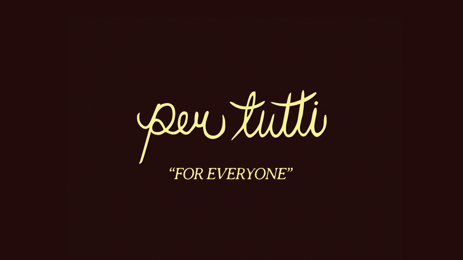
Per Tutti is a restaurant that brings people a sense of belonging, the Italian way. Their packaging aspires to evoke the nostalgia of textiles and storytelling found only in Nonna’s kitchen.

Credits: Can mock-up from RamStudio and box mock-up from Mr. Mockup.