Bachelor of Design in Visual Communication

Branding

Neeka

Yazdani

She, Her

Neeka is an Iranian Vancouver-based designer and illustrator who brings clarity and character to brands through thoughtful visual storytelling. Collaboration is her happy place; she thrives in team settings where energy, honesty, and a little creative chaos spark ideas. She’s drawn to work that feels warm, human, and whimsical.
CAPIC Rodeo 16, Illustration, Top 10, 2024
Capilano University, Dean’s List, 2022–2026
Wordmark for Borgo di Milliano’s Italian restaurant, inspired by classic Italian bodega typography, in brown, overlaid on a complementary beige background, with line illustrations of various pastas.
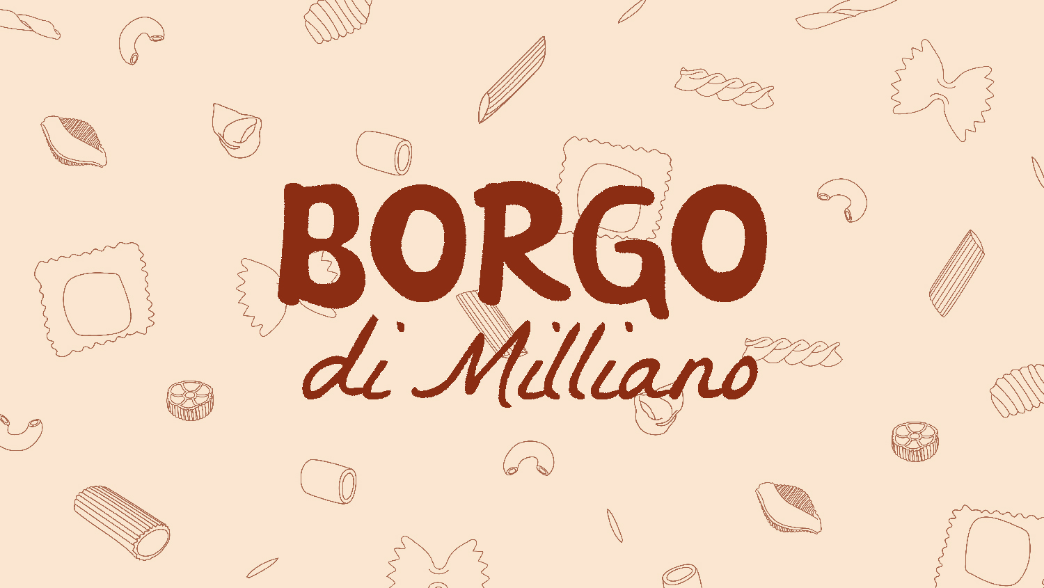
Borgo di Milliano is a local Italian restaurant that brings together the warmth of traditional cuisine and the spirit of community, nourishing both the heart and the stomach. Borgo di Milliano’s two-tone logo is inspired by classic Italian bodega typography.
Three pasta sauce jars arranged side by side on a white background, each labelled with a personalized character illustration on the front side.
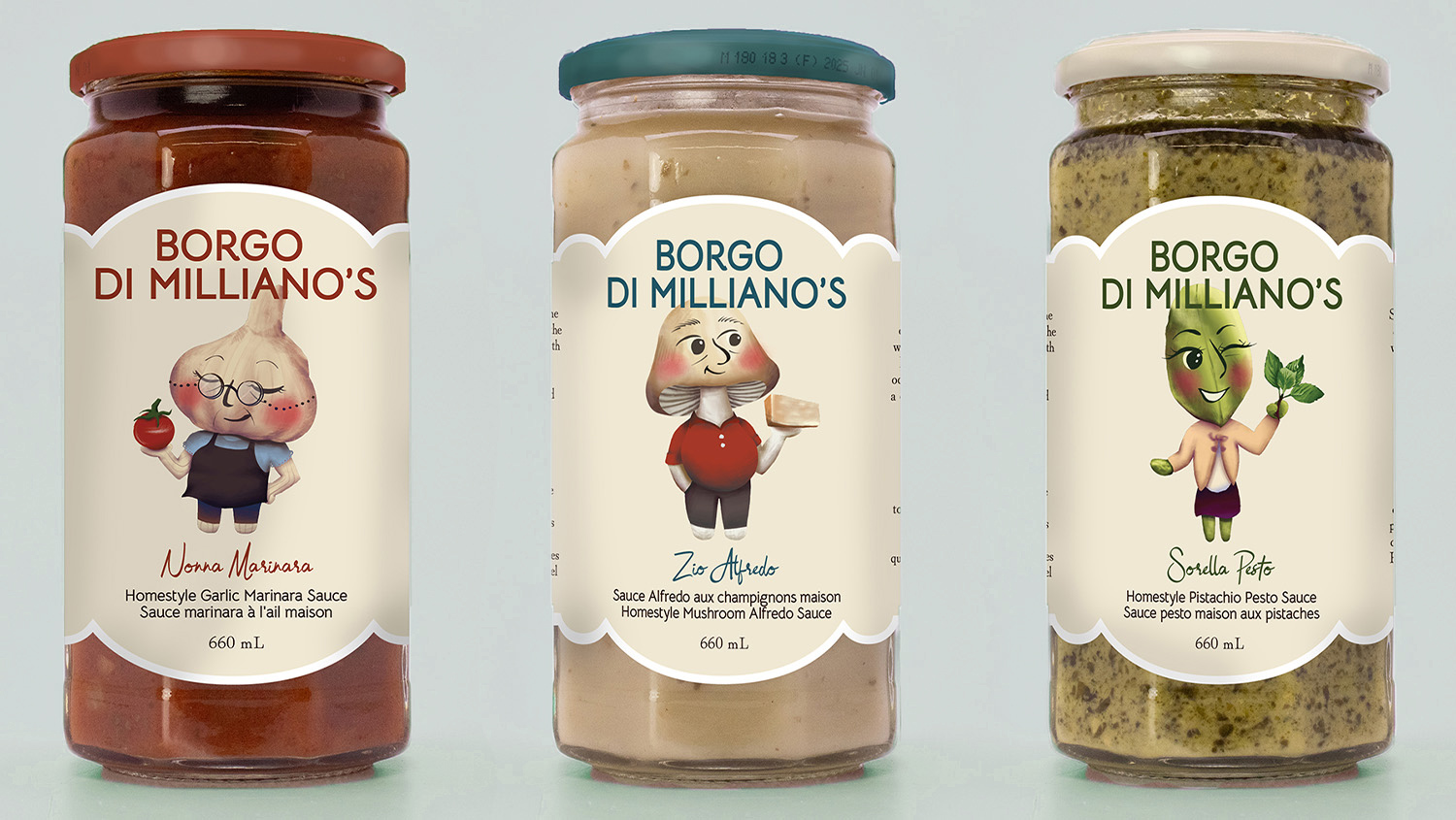
Brand identity and packaging series for Borgo Di Milliano, featuring custom character illustrations for in-house pasta sauce production.
Three illustrated music festival posters displayed side by side in a subway station, each featuring a space-inspired design with planets, stars, a rocket, and a personalized colour palette for each artist.
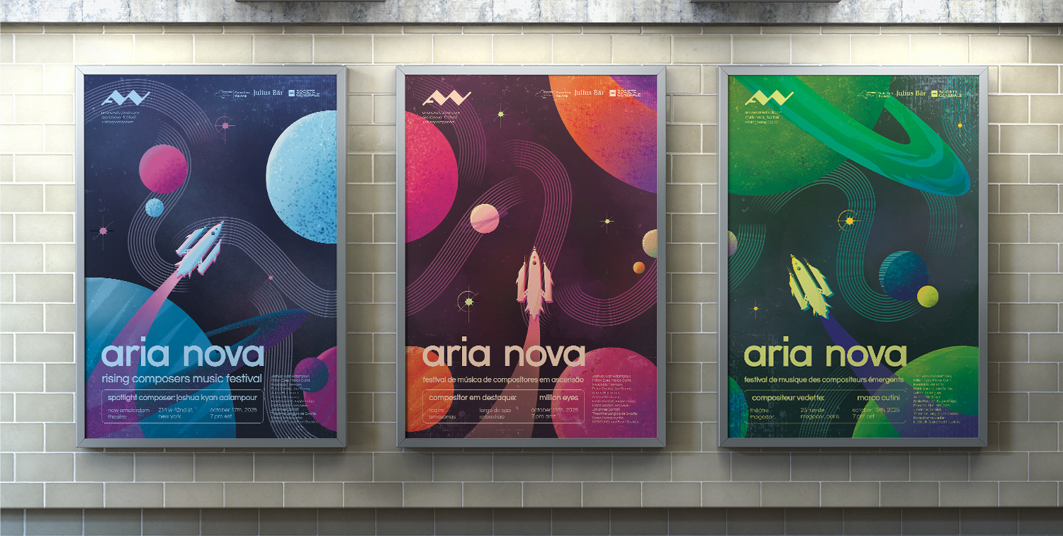
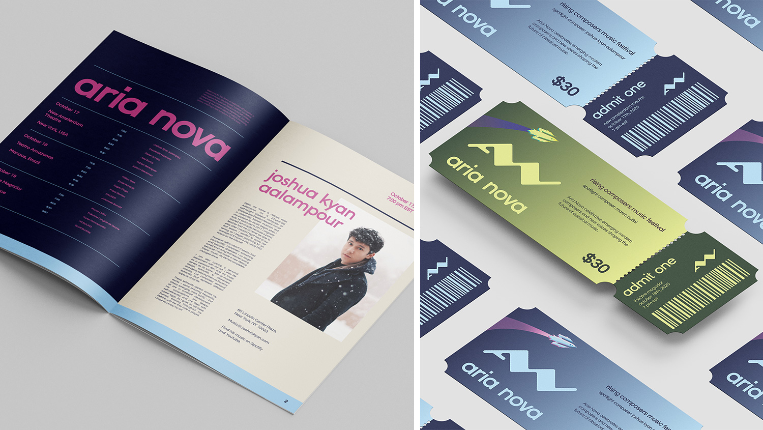
Illustrated poster series for Aria Nova, a modern classical music festival celebrating emerging composers and innovation within the classical genre.

Credits: Mock-up from Pixpine.

Aria Nova festival print collateral, including a program booklet with composer and festival information, and matching event tickets.
The Aria Nova festival collateral is designed to connect audiences with the featured modern classical composers and to promote their work.

Credits: Mock-ups from Pixpine and Mockups Design, portrait from Joshua Kyan Aalampour.

3D models of the Sunshine Coast Lavender boxes arranged together on a light gradient background, including packaging for essential oil, hand and body lotion, and facial toner.
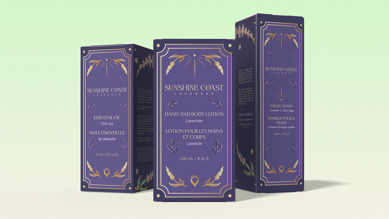
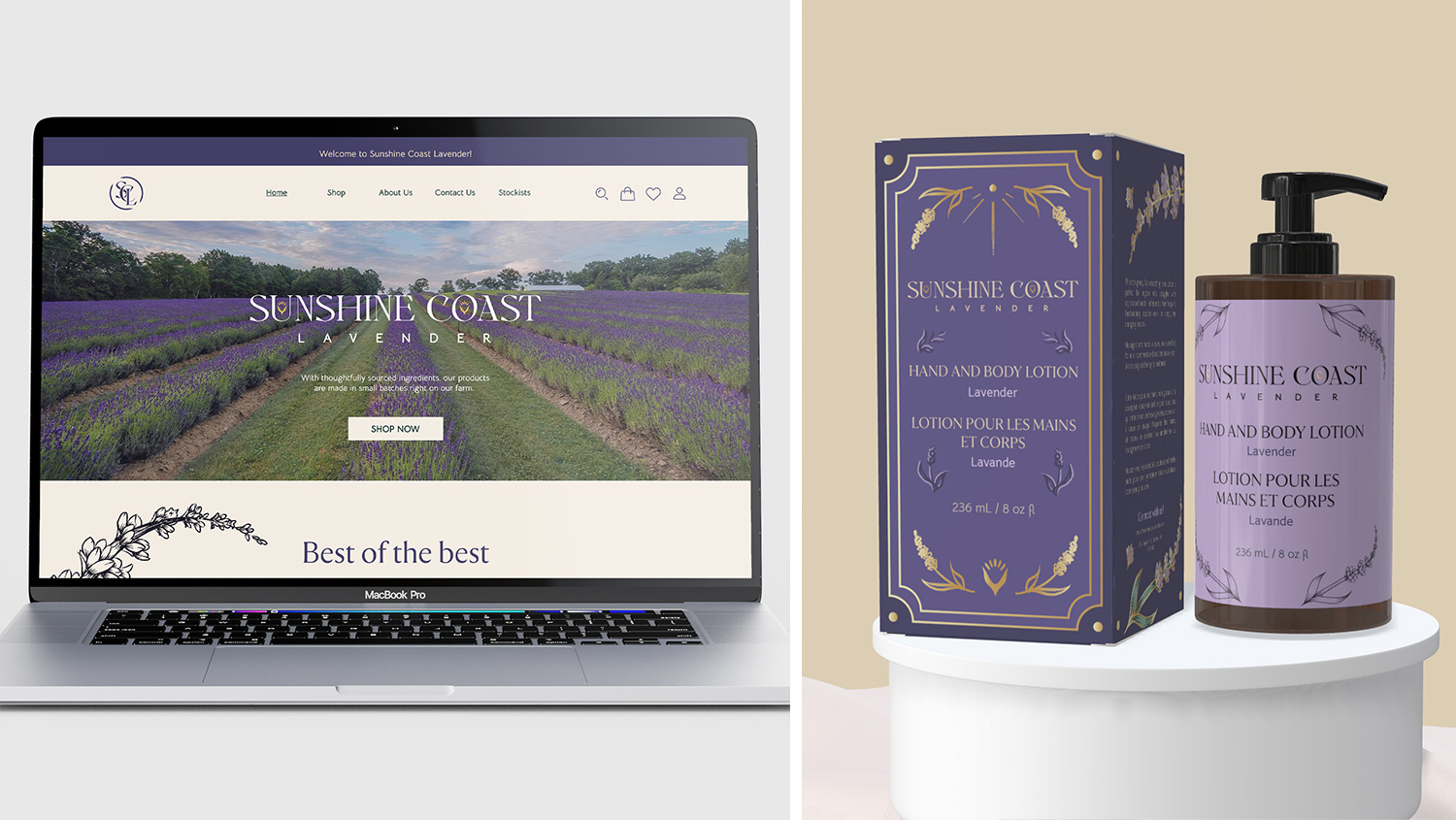
Brand identity and packaging for a local lavender farm entering retail, prioritizing sustainable printing and packaging.

Credits: Mock-up from Pacdora.

Laptop displaying the Sunshine Coast Lavender website beside a 3D model of a lotion bottle with matching product packaging on a pedestal.
Brand system for Sunshine Coast Lavender that supports a cohesive retail launch across physical and digital storefronts.

Credits: Mock-ups from Mockups Design and Pacdora, farm photo from Norm Ullock.