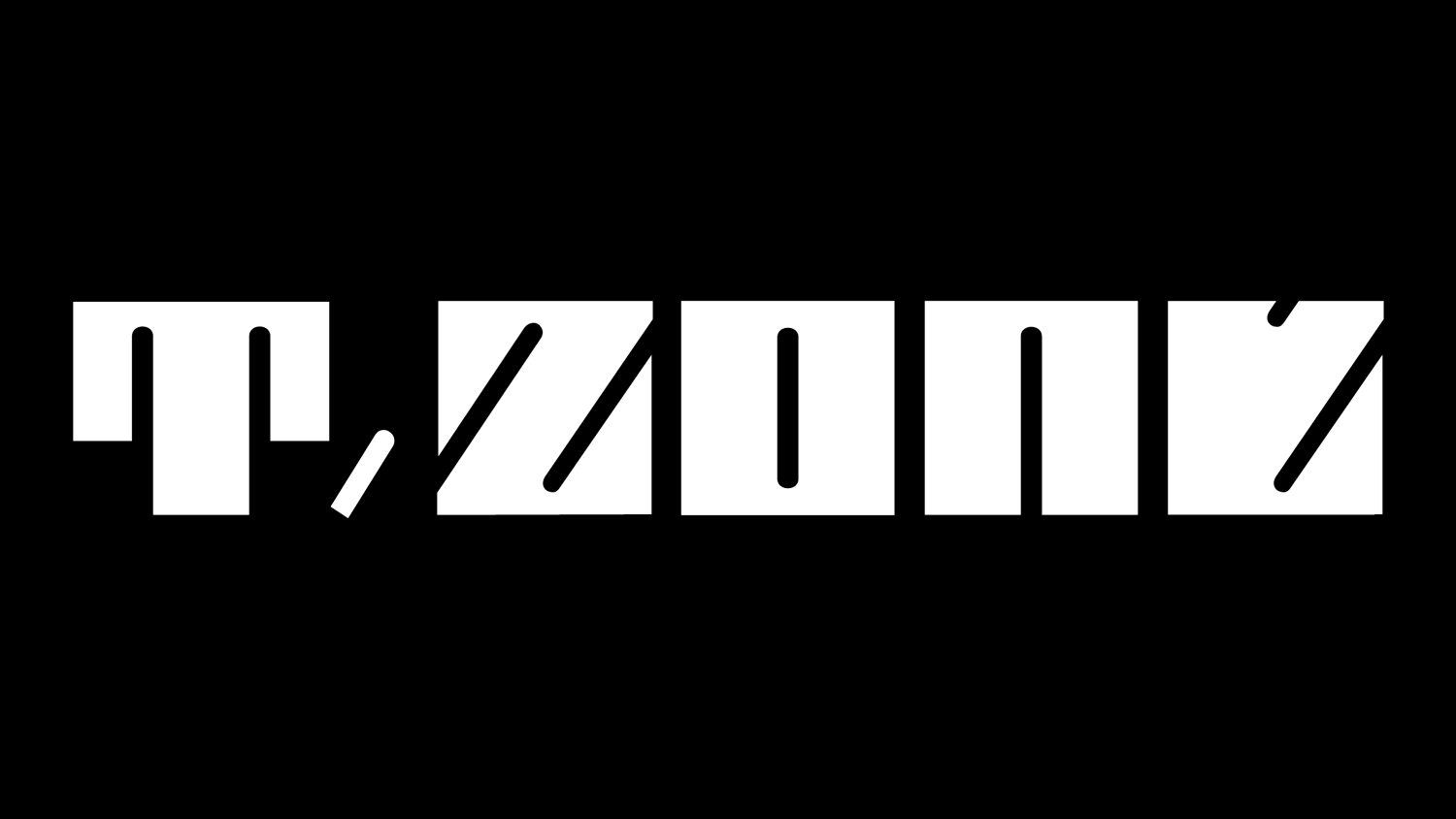
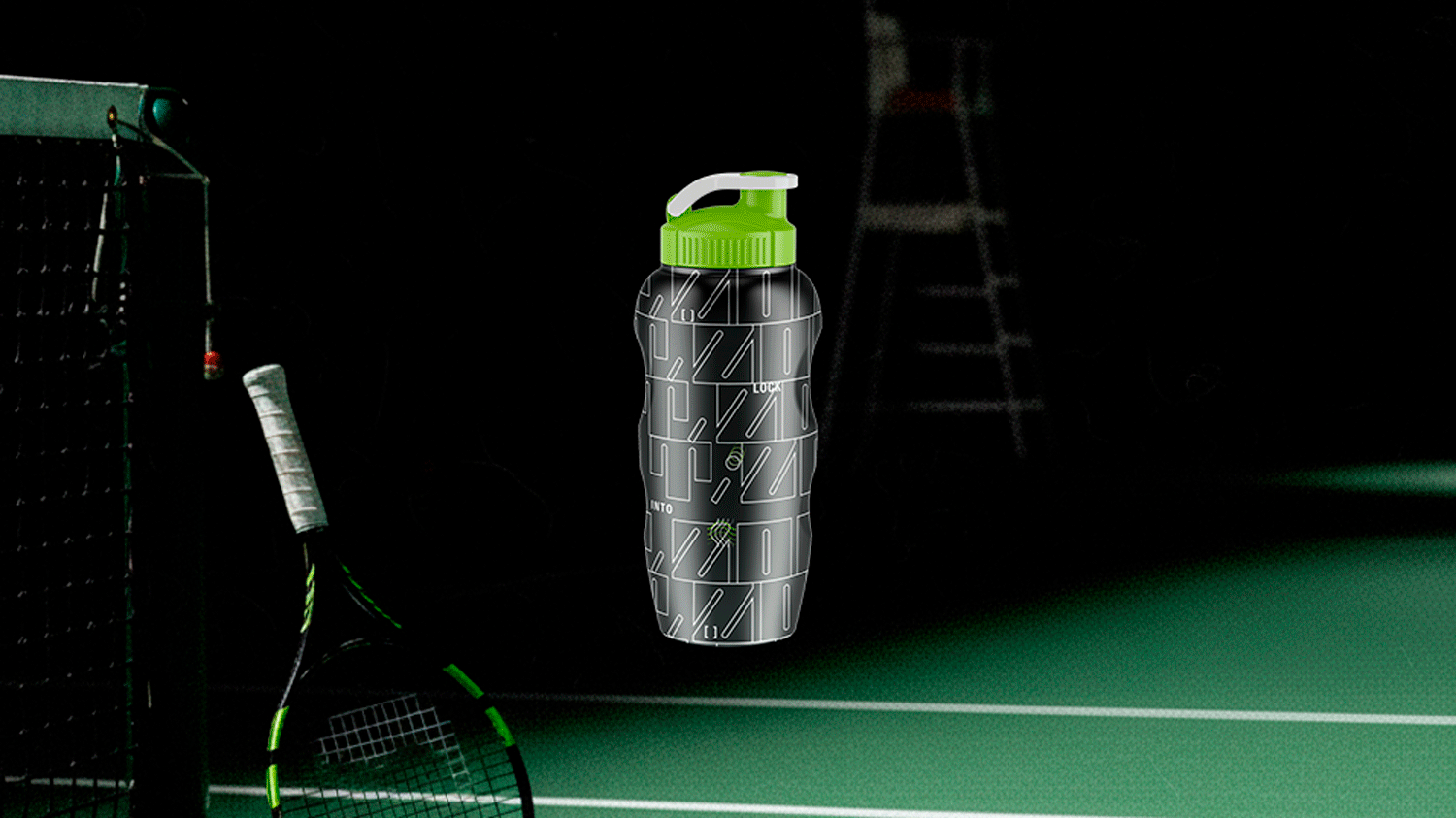
T.ZONE’s tennis brand identity merges modern and athletic energy through bold graphics, a lime-infused colour palette, and motion-inspired visuals. The identity is centred around the compelling slogan: “LOCK INTO T.ZONE for a high-end training experience.”
T.ZONE’s merchandise features cohesive brand identity elements and reflects the brand’s high-end presence in the premium market.
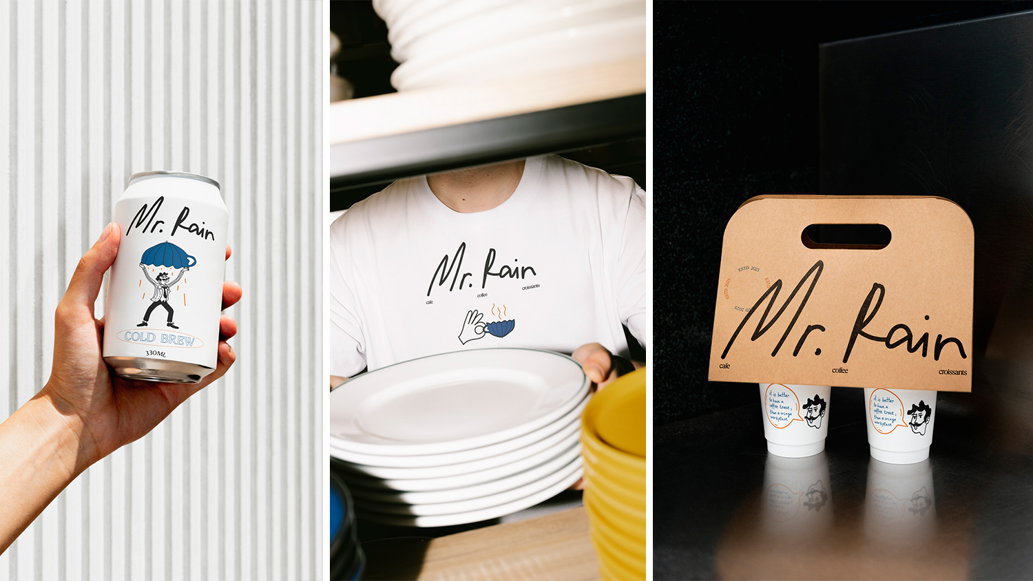
Designed for a trendy neighbourhood audience, Mr. Rain builds a quirky specialty coffee identity around a hand-drawn logo and whimsical character illustrations. Paired with a warm and inviting colour palette and typography, this visual system extends across packaging and apparel to create a cozy, cohesive brand experience.
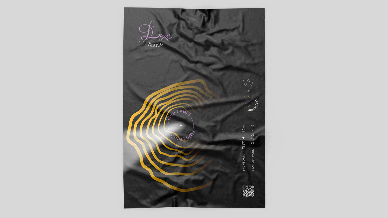
Lighthouse is a Vancouver-based electronic music festival celebrating hope through music. The visual system of the festival features dynamic graphics inspired by sound waves and maritime beacons, vibrant typography, and a colour palette that reflects its bright energy.
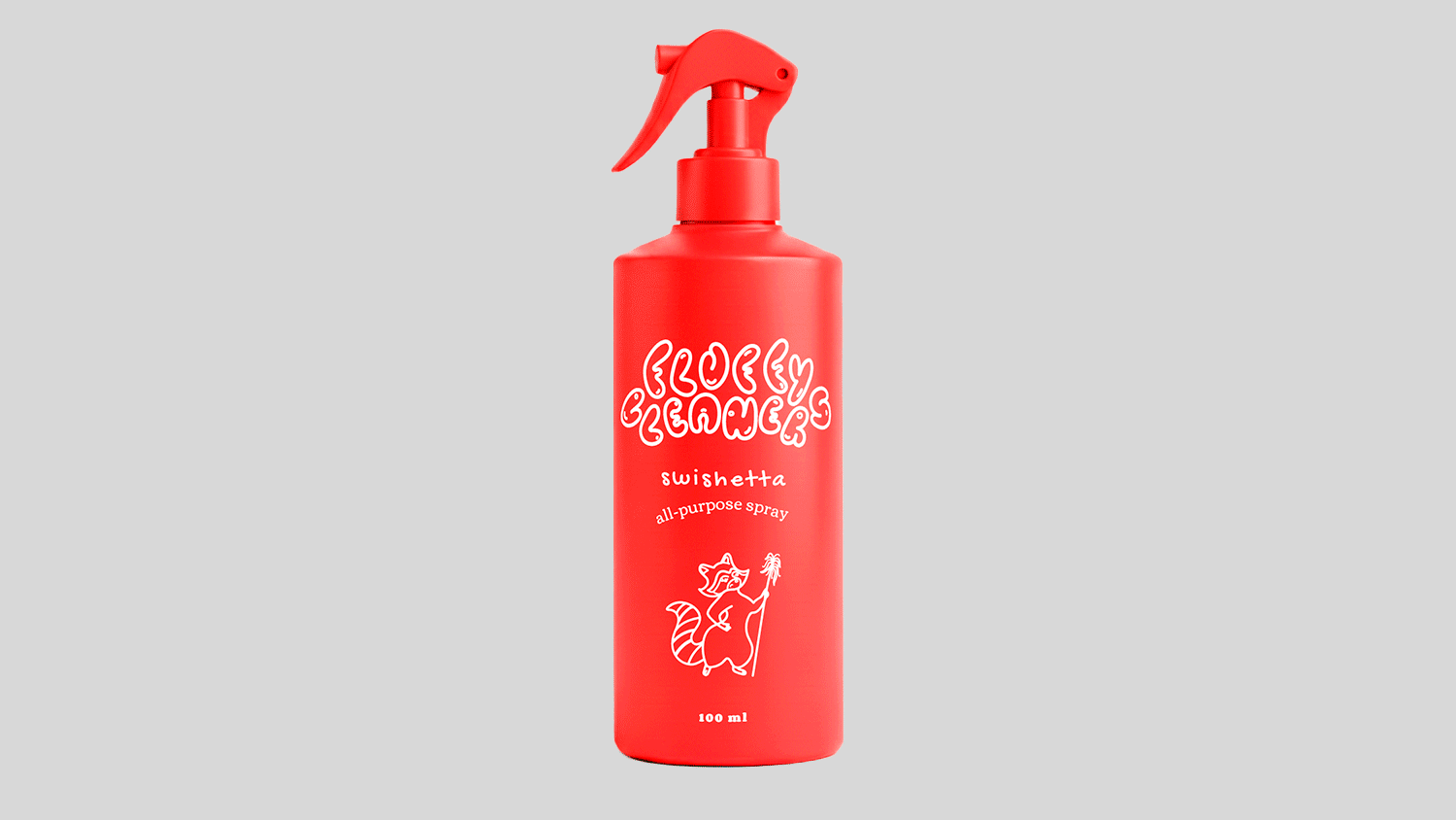
Fluffy Cleaners is a household cleaning product brand with a playful, modern identity that is reflected in vibrant packaging. The graffiti-inspired logo and quirky raccoon characters turn household chores into high-energy experiences.
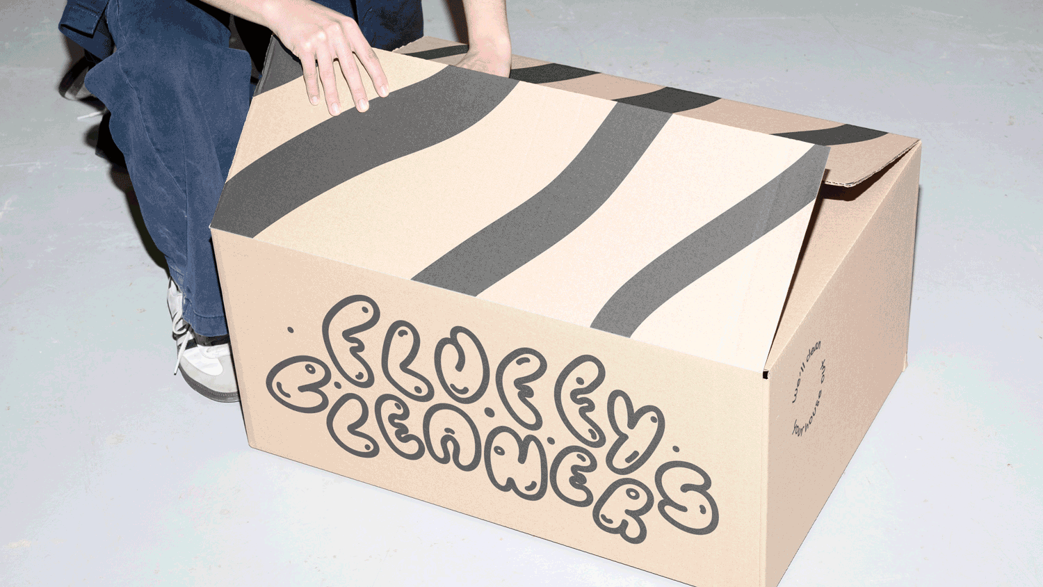
The Fluffy Cleaners identity extends to shipping boxes and apparel through a cohesive, trend-focused aesthetic. Wavy patterns hinting at the raccoon’s fur and the cheeky slogan, “We’ll clean your house out,” create a positive mood and a desire to try this brand.